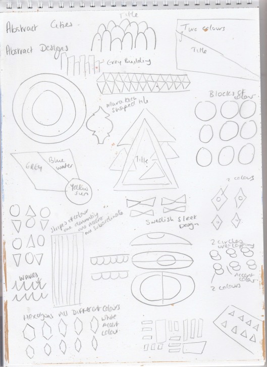
This exercise asks me to create 10 abstract designs in which you balance blocks of subordinate, dominant and accent colours. These designs are for 10 guidebooks for 10 different cities.
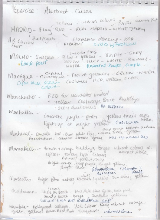
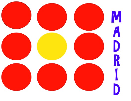
I choose the colours Red, Yellow, White and Purple for Madrid. Red and Yellow to represent the Spainish Flag and Purple and white to represent the Real Madrid football kits. I decided to use circles to represent footballs since their soccer team is such a famous one. Red is obviously the dominant colour for this design as I felt this was an appropriate colour for it because of it being in the spainish flag and red also being the colour of the costumes worn for flamenco dancing which is part of their culture.
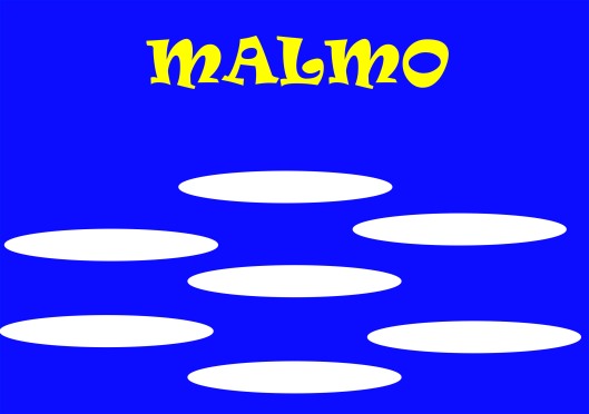
When I think of Sweden I think of sleek designs, this is why i chose to use oval shapes throughout this design and to keep the colour pallette simple. Blue is the dominant colour here it represents the colour of the swedish flag and also the colour of water for Malmo. The swedish flag is Blue, white and Yellow so I decided to stick to these colours. White also means for me clean and simple and I feel this portrays Sweden/Malmo culture.
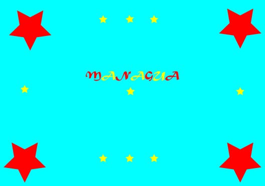
Managua looked like a very vibrant lively city. I choose Cyan blue as the dominant colour to represent the sea. I then chose Red as the subordinate colour and Yellow as the accent colour. These 2 colours are colours of the costumes that the locals were as part of their culture.
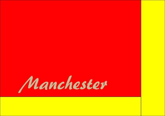
I decided to go for Red as the dominant colour and yellow as the subordinate colour because Manchester is so famous for its soccer club Manchester United and their jerseys are Red and Yellow. I done the font in grey as a accent colour representing the grey buildings in Manchester and cobbled streets.
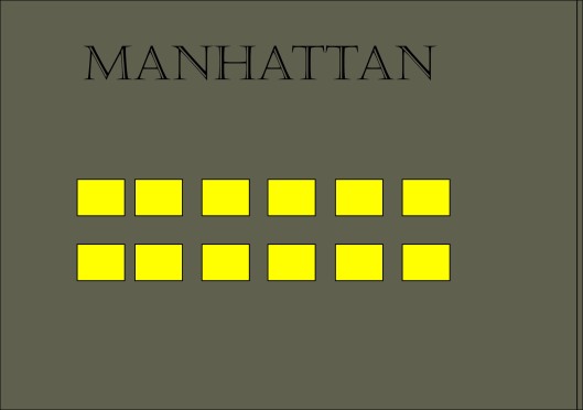
Manhattan was the easiest design for me. I chose grey as the background dominant colour because of the amount of concrete and buildings in Manhattan. I chose to do yellow squares representing the yellow taxis that are everywhere in Manhattan.
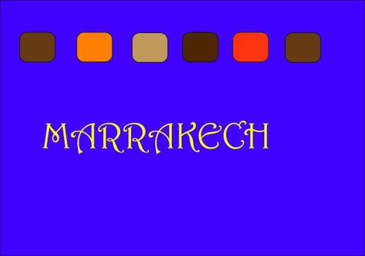
For some reason my Purples are coming out as blues when I upload my designs onto my blog. I choose Purple as the dominant colour as Marrakech as so many beautiful vibrant colours in its market stalls. I decided on Yellow for the font/accent colour because it is another vibrant colour you would see in the markets. I went for the spicy earthy tone colours for my abstract shapes to portray the spice souks in marrakech.
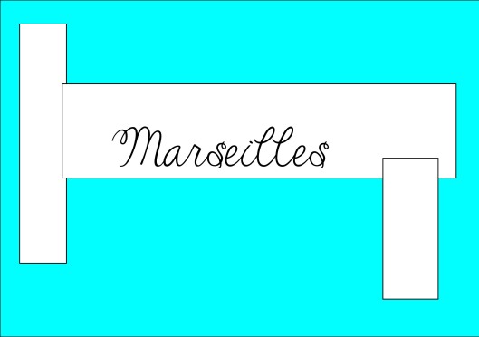
I chose the cyan blue for the dominant colour because of the sea in Marseille, I then decided to use White as the subordinate colour because I think it represents the white yachts in Marseilles. I opted for black as the font/accent colour also black for the outline of the white abstract shapes.
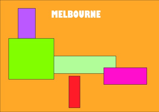
I opted for a sandy based tone colour for the dominant colour to represent the sandy beaches of melbourne. I then decided to use the colours of the iconic beach huts in melbourne for my abstract shapes. I choose white for the font as the accent colour.
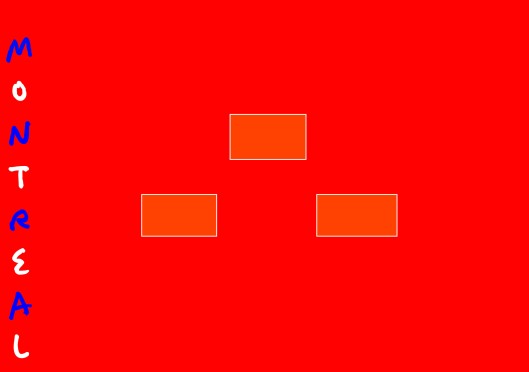
Red is the dominant colour here, I decided on this since it is part of the canadian flag. I kept with the flag theme and used white and blue for the font. The reason why I choose the deep orange abstract shapes is because if i thought they would represent the nice autumnal leaves that I saw in so many of the pictures of montreal.
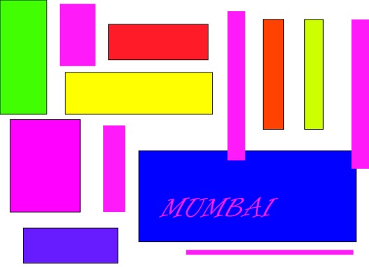
Mumbai for me means Colour. Holi colour, bollywood costumes etc.. so I decided to use bursts of colour in this design to represent all the vibrant colours of the costumes in mumbai.
I definitely feel like this exercize help develop some more skills in adobe illustrator even if they still are basic. It did make me think more in depth about how colour can have meaning everywhere. I did however find it time consuming and frustrating using adobe software as usual.